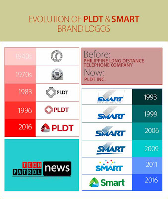
Today as I passed by the head office of the Philippine's high valued company PLDT, I notice something different than usual, they facade is now cascaded with a new PLDT Logo. Thus I recall the news just a few days ago that PLDT and Smart will have a new corporate logo that embodies unity and similarity in their new logo. So today I also decided to write about PLDT and Smart in this blog.
I remember in the early 1990's when PLDT was implementing their "Zero backlog program" where they attempted to complete its fixed-line rollout and phone installation to all applicants of its telephone service. That was triggered by the onset of competition from new telcos such as Bayantel, ETPI, Digitel and others, in the wake of the de-monopilization of the local telecom industry with Republic Act 7925 and similar government issuances. I remember how elated we are at home when we finally had our fixed phone line installed. I also had my first mobile phone from Smart back in 1998, its a motorola handset and had been a subscriber of Smart Communication until 2002. Who would have thought then that moving on more than two decades, these two communication giants would become part of one congolomerate.
Corporate Rebranding
PLDT Incorporated,
formerly called Philippine Long Distance Telephone Company, has evolved with
strategic rebranding, reflecting its 3-year massive digital transformation.
During a surprise launch last, June 13, PLDT and its
subsidiary, Smart Communications, Incorporated, launched their new logos and
change in name to better represent their current thrust to shift the business
to data-driven services. Philippine’s giant telco PLDT and Smart welcomes the new
day with a fresh brand identity as they launch new logos. PLDT chairman says the new logos symbolize
'the powerful convergence of PLDT and Smart, combining fixed and wireless
technologies to serve individual and enterprise customers.
New Company Name
In April 2016, the company then known as the Philippine Long Distance Telephone Company, dropped the "long distance telephone" from its corporate name and has since been known as PLDT Incorporated. Its board of directors approved the new corporate name to reflect on the company's new range of services, mainly focusing on data services. PLDT-Smart has embarked on a three-year digital pivot that
aims to transform into networks into the country’s most data capable
infrastructure delivering a growing array of compelling digital services.
This year, the Group has allocated P43 billion for capital
expenditures. Around USD100 million more in capex will be earmarked, following
the acquisition of the telecoms business of San Miguel Corp. which is referred
to as the 700 Mhz frequency band.
PLDT and its various subsidiaries such as Voyager
Innovation, Talas Data Intelligence are also developing and offering digital
and financial technology services that offer the Group’s customers higher
levels of efficiencies and convenience.
"Rather than allow ourselves to be disrupted by new
technologies, we are disrupting ourselves. We have embarked on a digital pivot
to enable us to serve the increasing needs of our people's digital lifestyle
and the country's growing digital economy," PLDT Chairman Manuel V.
Pangilinan said during the launch.
The country’s largest phone carrier has embarked on a 3-year
digital pivot that aims to transform its networks into a top data-capable
infrastructure.
New Logo Explained
The new logo symbolizes the powerful convergence of PLDT and
Smart, combining fixed and wireless technologies to serve individual and
enterprise customers.
The logos are shaped like a triangle with the three sides
representing Company’s business pillars — exceptional people, meaningful
innovations and its valuable customers.
The triangle also the symbol for Delta, the fourth letter on
the Greek alphabet, which stands for “Change”
PLDT’s logo is their fifth logo since the 1940s, while Smart
is their sixth since 1993.
The Evolution


No comments:
Post a Comment